credo
Fintech, UX Design Case Study
Redesigning Credo Web App for a seamless payment experience for over 1 million users and improving conversions significantly in the process
My Role
Product Designer
Project Context
- Timeline: Q1 2024
- Industry: Fintech
- Team: Product Team
Tools
- Figma
- Google Doc
- Linear
At Credo, I collaborated with a team of two product designers to revamp the web app. We redesigned the web pages, introduced new features to the Credo dashboard, and improved the merchant onboarding flow. For my case study, I will focus on the design improvements made to the Credo landing page.
Overview
Credo is a payment solution platform that streamlines business transactions by offering tools like payment gateways, payment links, and invoicing services. It helps businesses manage and receive payments more efficiently, ensuring a seamless transaction experience for both merchants and customers.
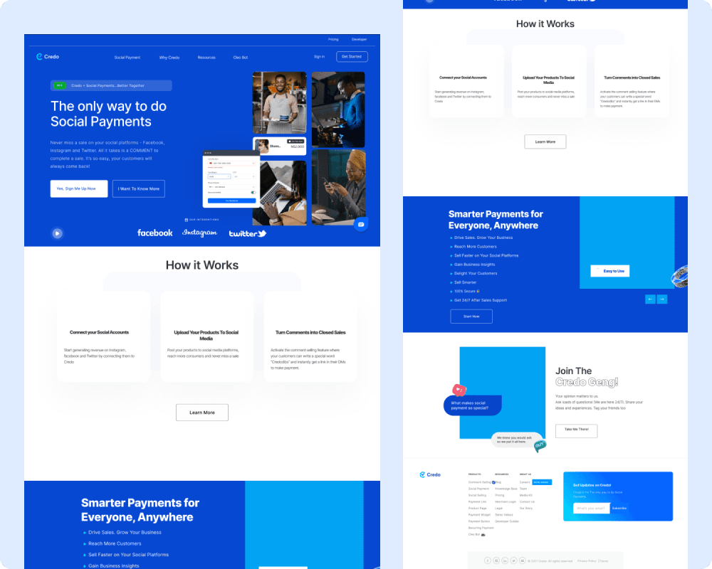
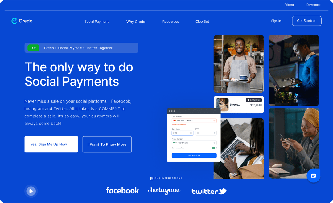
Old Landing Page
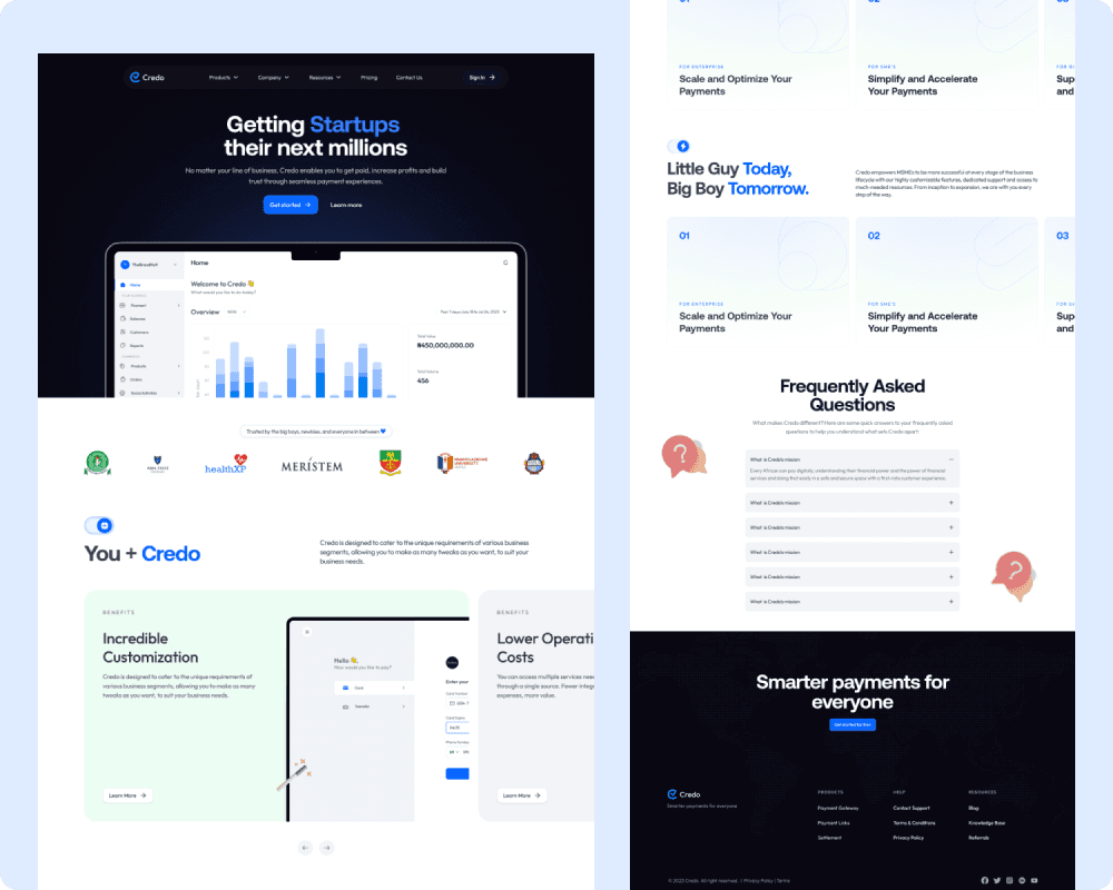
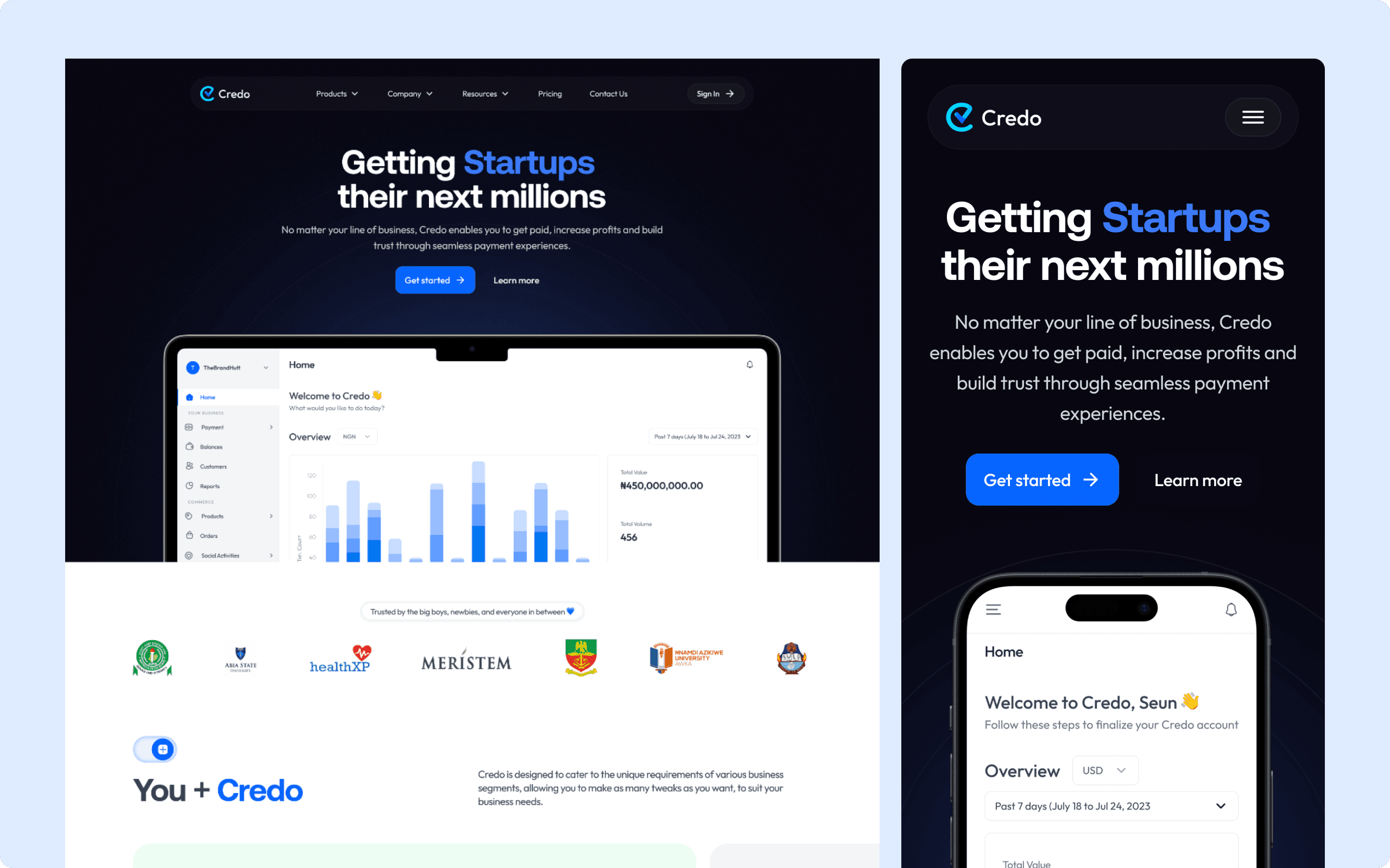
New Landing Page
The Problem
The old version of the Credo web app had a static and unclear user experience, resulting in high user drop-offs and low conversion rates. Users struggled with confusing navigation, which made it difficult to find information and understand the value of Credo's offerings, leading to abandonment before completing key actions. Also, lack of emphasis on core features diminished trust and engagement, ultimately failing to convert visitors into customers.
The Solution
A Refined Navigation Bar
The navigation has been simplified to make it easy for users to explore the web app. It has distinct navigation links which are Products, Company, Resources, Pricing and Contact Us. Users can find what they need quickly. It also contains a clear Call To Action Button which prompts users to sign
The Nav links explained:
- Products: Products on the nav bar allows users to navigate through Credo's offerings and payment solutions. It has sub links which are Payment Link, Payment Gateway and Settlement.
- Company: Company on the nav bar provides users information they need to know about the company. It has sub links which are Why Credo, About Us and Frequently Asked Questions.
- Resources: Resources on the nav bar provides users the resources they need to use the Credo Web App. It has sub links which are Blog, Knowledge Base, Transactions Search, Developers Playground
- Pricing: Pricing on the nav bar leads users to page which provides details of different payment plans users/businesses can subscribe to.
- Contact us: This leads users to the page where they can drop questions/comment for the customer care to respond

Old Nav Bar

New Nav Bar
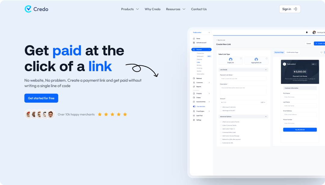
An Improved Hero Section
The hero section has been redesigned to create a visually engaging and user-friendly introduction that immediately captures the users' attention and sets the tone for the rest of the page. In place of the old images, a new image showcasing a glimpse of the Credo dashboard has been introduced to give users a quick preview of the product. Also, “Get Started” and “Learn More” CTAs are now prominently displayed encouraging users to take action. These CTAs strategically guide users through the conversion funnel, moving them from discovery to sign-up with ease.
Old Hero Section
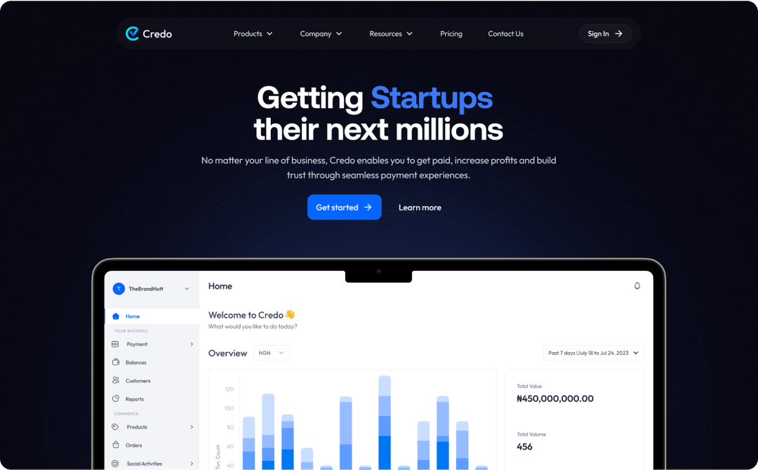
New Hero Section
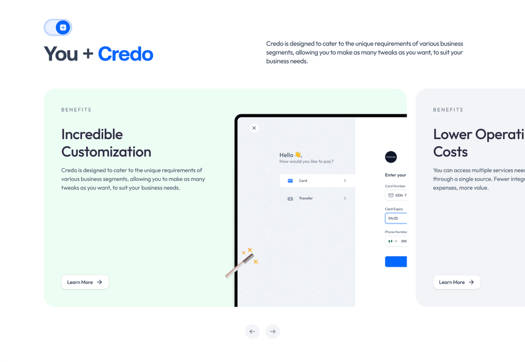
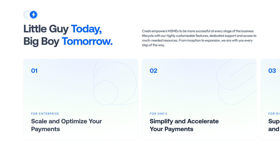
Clear Highlights of Core Benefits and Features
In the new version of the Credo landing page, Core features and benefits of Credo's payment solutions are showcased in a visually engaging way, making it easier for users to understand how Credo can help their businesses grow
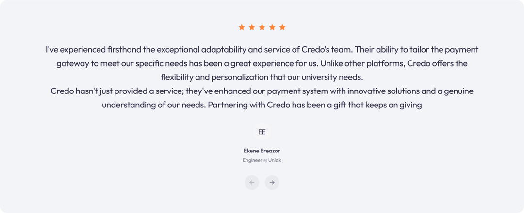
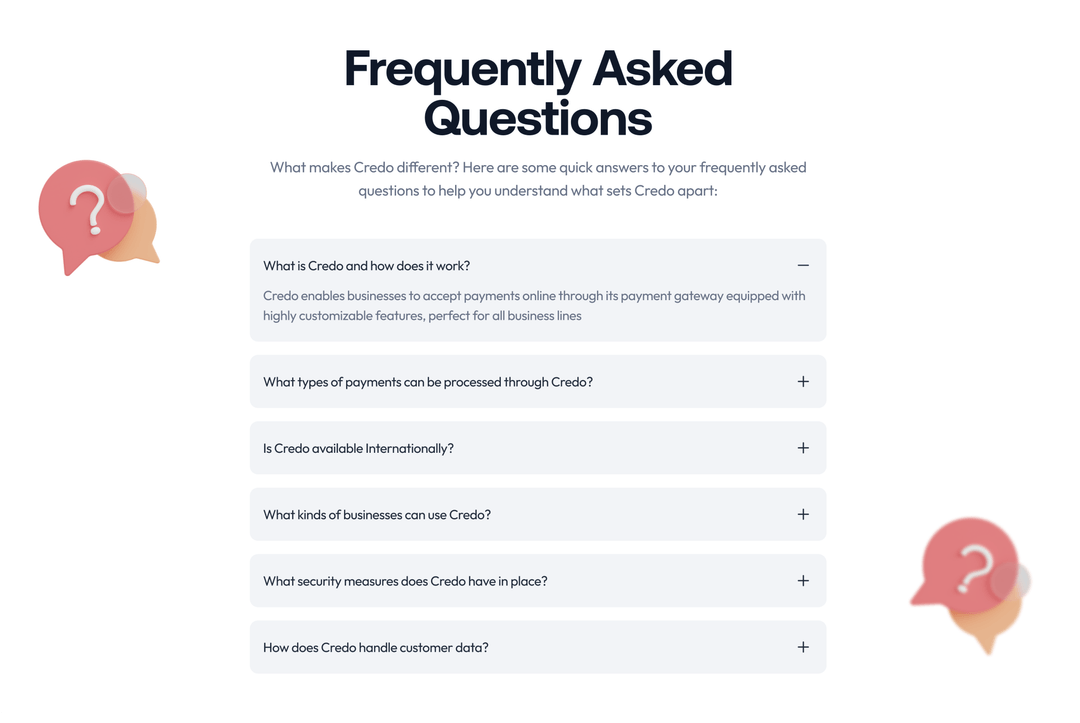
Inclusion of Testimonials and FAQs
Inclusion of testimonials and a FAQ section has been included in the new Credo landing page to build trust and address common user concerns, enhancing credibility and improving the decision-making process.
The Design Process
The design process was in 5 iterative stages: Discover, Define, Design, Test and Deliver. The design decisions were based on direct user feedback, estimated conversion rates, and considerations for design scalability. Design iterations were fast with rapid feedback.

Discover
- Web App Analysis
- User Interviews
- Competitive Analysis

Define
- Problem statement
- Information Architecture

Design
- Ideation
- User Flow
- Wireframing
- Prototyping

Test
- Internal Testing
- A/B Testing
- Rapid Feedback

Deliver
- Engineering QA
- Design Implementation
User Interview
To understand the core issues with the old web app, we conducted several user interviews and gathered feedback from existing users. The goal was to identify pain points, such as difficulties navigating the site and understanding Credo's offerings.
Key insights from user research
- Confusion about Credo's Value Propositions: One of the most common findings was that users did not clearly understand what Credo offered or how it could benefit their businesses. Interviewees mentioned that the old website failed to explain Credo's payment solutions concisely. Users expressed frustration with the lack of clarity around why they should choose Credo over competitors
- Difficult Navigation: Many participants highlighted that navigating the website was cumbersome. They found it hard to locate important sections, such as product descriptions, pricing, and service details. Several users noted that they had to click through multiple pages just to find basic information, which caused frustration and often led them to abandon the site.
- Lack of Visual Appeal and Modern Design: Users consistently described the old website as “outdated” and “cluttered.” They felt the design did not align with their expectations for a modern fintech platform, causing doubts about Credo's credibility and professionalism. This lack of visual appeal made users less inclined to engage with the site or explore it further.
- Low Trust due to Missing Social Proof: Another critical finding was that users felt uneasy about signing up for the service because there were no strong trust signals. Most interviewees stated they wanted to see customer testimonials, case studies, or other forms of social proof to verify that Credo was a reliable and effective platform.
- Unclear Call to Actions (CTAs): Interviewees struggled to identify the next steps, such as how to sign up or start using the service. They felt the website lacked clear, well-positioned CTAs that would guide them through the journey, from understanding the benefits of the platform to making an account.
- Interest in Educational Content: Users also expressed a desire for more educational resources, such as FAQs, how-to guides, and blog posts, that would help them learn more about Credo's services and how to integrate them into their businesses. They wanted a way to find out about product features and pricing without needing to contact support directly.
Competitive Analysis
We conducted an analysis of three leading competitors to identify their key strengths and weaknesses. These competitors are Flutterwave, Paystack and LemonSqueezy The results are summarized in the image below.
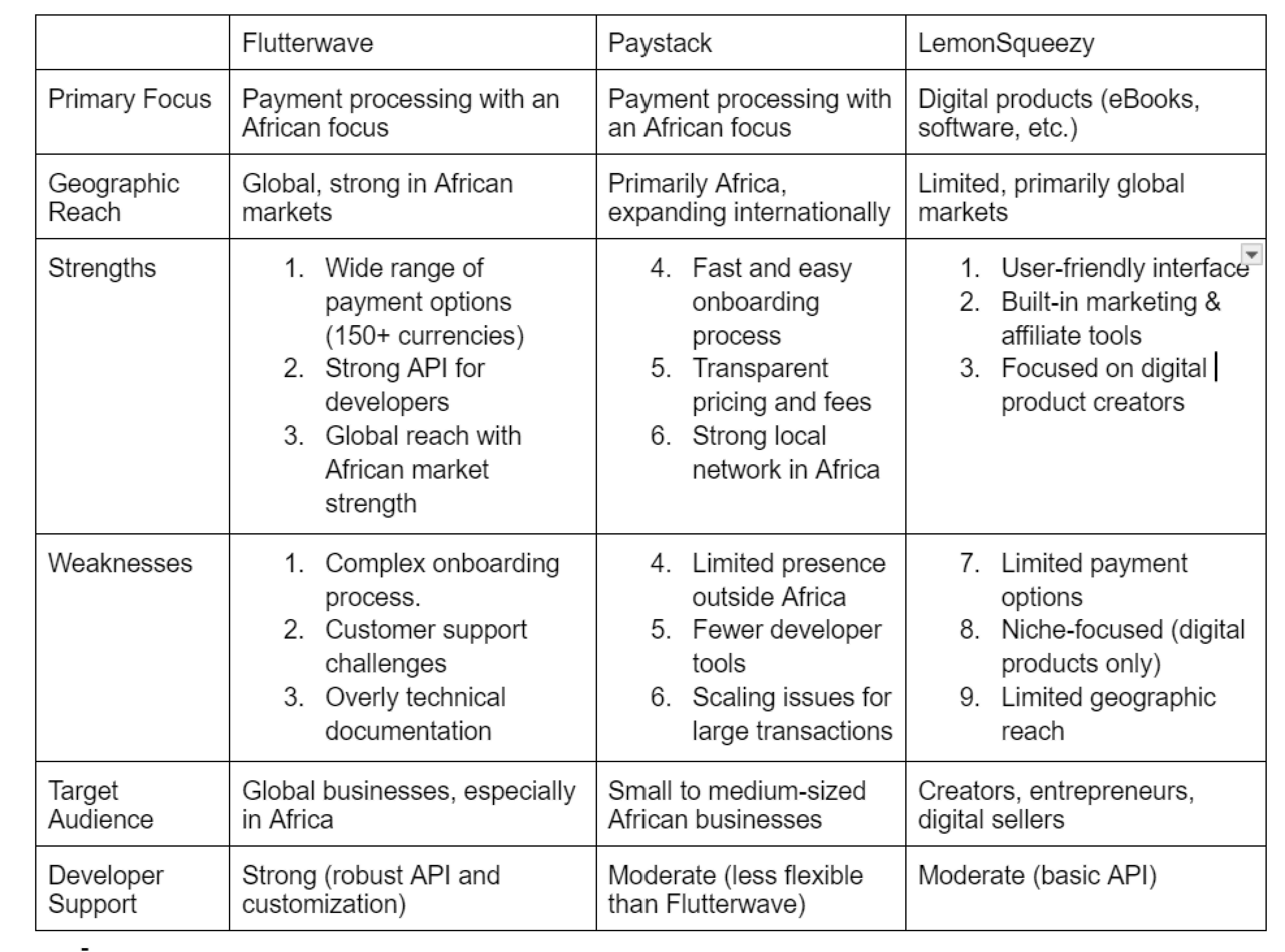
Tabular Representation of Insights from Competitive Analysis
Design Iterations- A/B Testing
As part of the A/B testing process, users were invited for interviews to gather qualitative feedback on both hero section designs. During the interviews, participants were asked about their first impressions, clarity of messaging, and overall visual appeal. Most participants commented that Version B had a clearer, more compelling CTA with the “Learn More” button encouraging them to explore further. Additionally, the participants expressed that the simplified and well-organized navbar in Version B made navigation easier, as it quickly directed users to essential sections like products and pricing. In contrast, Version A was perceived by most participants as having a less engaging CTA and a less detailed navbar, which contributed to lower interaction rates. These insights were useful in refining the final design by prioritizing user-friendly CTAs and intuitive navigation.
Version A (Archived Design)

Version B (Final Design)
The Impact of The Solution
The redesign of the Credo web app yielded significant improvements, showcasing the value of a user-centred approach implemented throughout the design process. Below are the key metrics and percentage changes that highlight the success of the redesign based on web app analysis and user feedback.
- 17% increase in conversion rates—more users signing up and completing key actions.
- 40% reduction in drop-offs, particularly on key pages like the landing page and product pages.
- 22% increase in time spent on site, reflecting higher user engagement.
- 28% growth in inbound leads and inquiries, driving more business opportunities.
- An increase in user trust due to the addition of social proof elements.